The third stage in my project to create a Necromunda themed league was to produce the images and icons for the teams. Not being much of an artist (C-grade GCSE, just) this was perhaps the most daunting step for me.
I quickly discovered that as with most things in life having the right tools for the job helps immensely. For that I would strongly recommend paint.NET, after trying Gimp (an online post I found while trying to figure out how to do something pretty basic in Gimp made one of the best observations about the programme which I will quote as I can say it no better: "To do anything in Gimp you need to use a mixture of educated guesswork, latin incantations and the blood of at least one virgin") and a couple of online pixel editors (which
Piskel was probably the best) I have found that it is by far the easiest and most intuitive image editor of those I have tried.
Also always save in .png file format, it is just that much better than any of the others!
First I created some images to represent the Houses - these are the images that appear on gamefinder, and the game in progress pages to represent to teams competing. I based each on the House icon from the Necromunda game.
| Orlock | Goliath | Van Saar |
 |  |  |
| Escher | Delaque | Cawdor |
 |  |  |
Next I dived into creating the icons for the teams based on the iconic appearance of the different gangs in the Necromunda fluff.
It took a while to figure out how the size of the icons was determined by the client, but I think it works by measuring how many pixels wide the image is then dividing this by 4 to get the size of one the icon (because the image is always composed of Inactive Red Icon, Active Red Icon, Inactive Blue and Active Blue, ie always 4 icons across). Individual icons are then squares of that size - so if the image is a total of 112 px wide each icon must fit into a 28 x 28 px square.
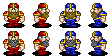
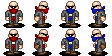
House Orlock
The look of this house has two distinct features - bandannas and sleeveless flack jackets.
I used thrall icons from the CRP Vampire roster for the base for these players, adding elements from the CRP human catcher and thrower icons to help distinguish the runner and kicker positionals.
Linemen

Blitzers

Runners

Kickers
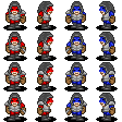
 House Goliath
The look of this house is lots of muscle, metal chains, and mohican hair.
For the linemen I de-bearded some Norse icons from the CRP roster (had to wait until they passed out drunk before I dare go close with the clippers!) and gave their hair a bit of a dye job.
The Brutes are an almost direct lift of the SL Albion Fen Guard and the blitzers are taken from the CRP Pact Marauders with just a change of skin tone to match the other players. Finally the Ogryn is another direct lift being the most Goliath looking icon from the CRP Ogre roster.
Linemen
Brutes
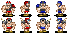
Blitzers

Ogryn
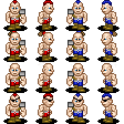
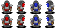
 House Van Saar
This house has the very particular look of super high tech onesies. Fortunately the CRP Welfs have a similar fashion sense so these formed the basis for the Van Saar icons, all that was required was to clip their pointy bits and de-bejazzel the front of their leotards (which makes them look "sooo not as fabulous dahling" as one Woody victim put it) and the catchers swapped out the YMCA dance poise of their Woodie opposite numbers in favour of a more Human catching mit.
The Squats are taken from the CRP dwarf runner icon (which is the least fantasy looking), recoloured to match the human players on the team.
Linemen

Thrower

Catchers

Squat Blockers
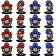
 House Escher
This all women house has a look that is born of their 80s inception - Big hair and crop tops.
Again I was fortunate to find several existing icons on which to base my Escher players, I drew from the CRP Witch Elves and the two SL Slaanesh teams. In each case I got rid of the bikini bottom look and gave some of them more stompy footwear, however it was the breasts I spent the most amount of time tweaking (sorry just can't avoid a good double entendre), crop-tops didn't work so they stayed with the combat bikini look just with a slight augmentation on the side views.
Linewomen
Blitzers

Catchers

Throwers
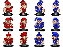
 House Delaque
Like all Necromunda gangs the Delaque have a distinctive look that I wanted to reflect in the icons. In this case it is bald, with shades and long trench coats.
I started by shaving the moustache from the bald CRP Vamp thrall then redressed him in Delaque style with minor variations to distinguish the positionals (I did start by giving them brown trench coats but that just made them look like janitorial staff). I also chose to avoid using the brightest shade of red or blue to further emphasis the shady looks. Of all the teams I think I am most pleased with how the icons for this House have turned out.
Linemen

Enforcers
Runners

Assassin
 House Cawdor
This house is the least 40k looking - all the members of the house wear heavy cowles and masks that cover their faces and their clothing is medieval in look. For the base for this team I once again used the CRP Vamp Thralls, this time combined with the hood from Horkon Heartripper. Additional details were added, including the masks, to help distinguish the positionals.
Linemen
Blitzers
Blockers
Preacher

Finally there are the player portraits. These proved to be the most difficult as the portraits that exist for CRP and SL are true pieces of art, far beyond my talents and short of farming the task out to someone more adept I was at a loss as to how to fill up the 95 x 147 px space.
After much fruitless internet searching I decided simply to use what I already had - the pixels for the positions and the house logos, these along with the abstract icon for the position make a sufficient but not ideal portrait (one example is shown below for illustration)

So with one of the biggest challenges finished I now need to move on to testing using test mode and thinking about a few star players to add to the mix before inviting volunteers to try the rosters out in a simple test league.
It feels as though I'm almost there - but plenty to go wrong yet, and with work kicking off again its starting to be a race against time to get this finished before I run out of holiday time.