princevaliant

Joined: Nov 12, 2006

|
 Posted:
Apr 24, 2010 - 02:51 Posted:
Apr 24, 2010 - 02:51 |
 
|
|
Reisender

Joined: Sep 29, 2007
|
| Posted:
Apr 24, 2010 - 03:10 |
|
nice 1
but silly poll question when the answer is so obvious.... or why do you think they are called Vam-PIE-rs |
|
|
Catalyst32
Joined: Jul 14, 2008
|
| Posted:
Apr 24, 2010 - 04:15 |
|
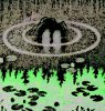
Also chose pie because those Vampires look kinda fat. |
|
|
harvestmouse
Joined: May 13, 2007
|
| Posted:
Apr 24, 2010 - 13:07 |
|
Sexeh.
Vampire 1 is a must. I'm too drunk to workout number 3 though. Number 2 looks to be a good alternative to various players. Vamp, CW, human/de blitzer, wight.....valuable icon. |
|
|
f_alk

Joined: Sep 30, 2005
|
| Posted:
Apr 24, 2010 - 13:41 |
|
I love teh first one ... any Nosferatu is great!
The third ... well .... women and dripping blood - is it that time again? 
(Really, in general I like that icon, it looks like a great start for the LRB6 star Roxanna Darknail(?), the DE Witchelf ... after changing the skin colour to the DE scheme it should look marvellous for that). |
|
|
princevaliant
Joined: Nov 12, 2006
|
| Posted:
Apr 26, 2010 - 18:54 |
|
| f_alk wrote: | | women and dripping blood - is it that time again? |
 Yes it is a bit..extreme. But hey, they're supposed to be bloodthirsty right? heh heh Yes it is a bit..extreme. But hey, they're supposed to be bloodthirsty right? heh heh
In all honesty the reason I chose to animate blood instead of turning her sideways is because I'm just such a terrible artist! xD Animating blood was *much* easier. Anyone is welcome to change these or borrow whatever they like, just share it! |
|
|
svemole
Joined: Feb 09, 2006
|
| Posted:
Apr 26, 2010 - 19:45 |
|
I also think the first one is very good. |
|
|
maysrill
Joined: Dec 29, 2008
|
| Posted:
Apr 26, 2010 - 19:49 |
|
All are fine. #1 is quite good. |
_________________
Author of Firehurler (Twinborn Trilogy Book #1), Aethersmith (Book #2), Sourcethief (Book #3) |
|
DonTomaso

Joined: Feb 20, 2005
|
| Posted:
Apr 26, 2010 - 19:59 |
|
Love the vampires... they look like Mr Burns... |
_________________
====================================
Be careful, my common sense is tingling! |
|
Shraaaag
Joined: Feb 15, 2004
|
| Posted:
Apr 26, 2010 - 20:07 |
|
I like the first icon. I don't have an opinion about the second (except I'm not used to seeing vampires with horned helmets). And the third one's shoulderpads and hair made it look like a hunchback. Have in mind, my eyesight is not very good. |
_________________
 |
|
princevaliant
Joined: Nov 12, 2006
|
| Posted:
Apr 29, 2010 - 19:35 |
|
| Shraaaag wrote: | | And the third one's shoulderpads and hair made it look like a hunchback. |
heh heh! You're right though, she kinda does look odd. I had a little too much fun with that one, and she ended up looking like a freak. I was basically trying to make a vampire icon to fit this picture:
[url=http://img99.imageshack.us/img99/8154/204359.jpg] [/URL] [/URL]
I think I have a ways to go!
Thanks for the suggestions and thoughts everyone, going to keep them in mind as I work on vampire #3 a bit more and on other new icons. |
|
|
WhatBall

Joined: Aug 21, 2008
|
| Posted:
Apr 30, 2010 - 16:13 |
|
One of the icons seems to have vanished. Can you reload it? |
|
|
MattDakka

Joined: Oct 09, 2007
|
| Posted:
Aug 20, 2010 - 20:53 |
|
Amazing work! Thanks for uploading them! |
|
|
On1

Joined: Jul 12, 2004
|
| Posted:
Aug 20, 2010 - 20:56 |
|
What do you know, a dorf trained in the art of necromancy O_o |
|
|
|
|


